Some of the work! This page exists for anyone who wants to dig a little deeper. A selection of projects across campaigns, brand identity, TV, digital and more. Some big, some small, make yourself at home.
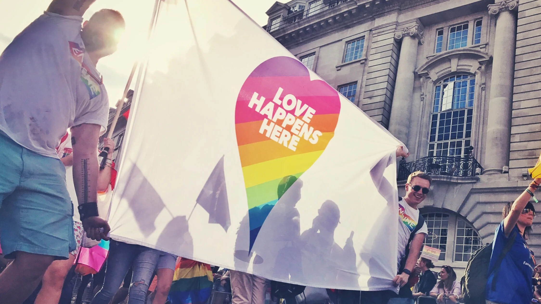
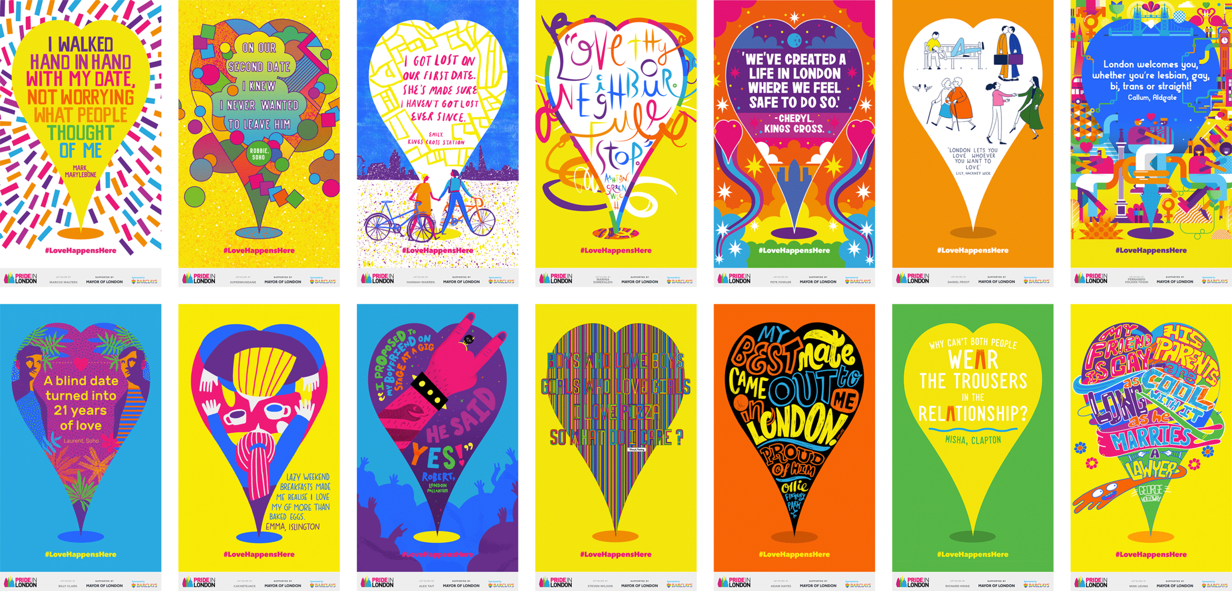
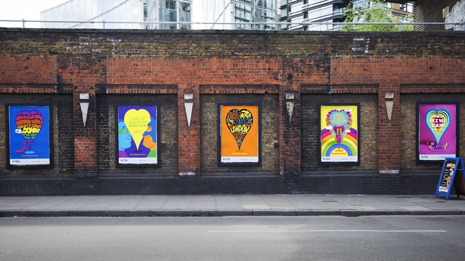
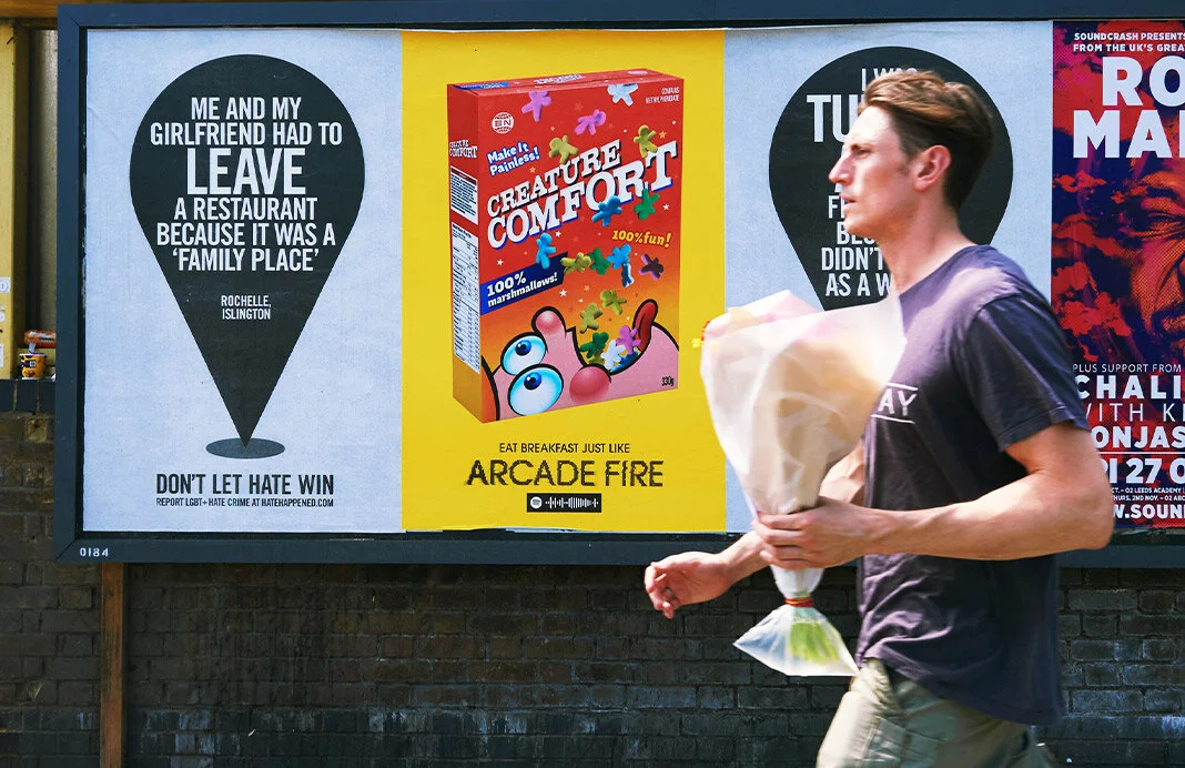
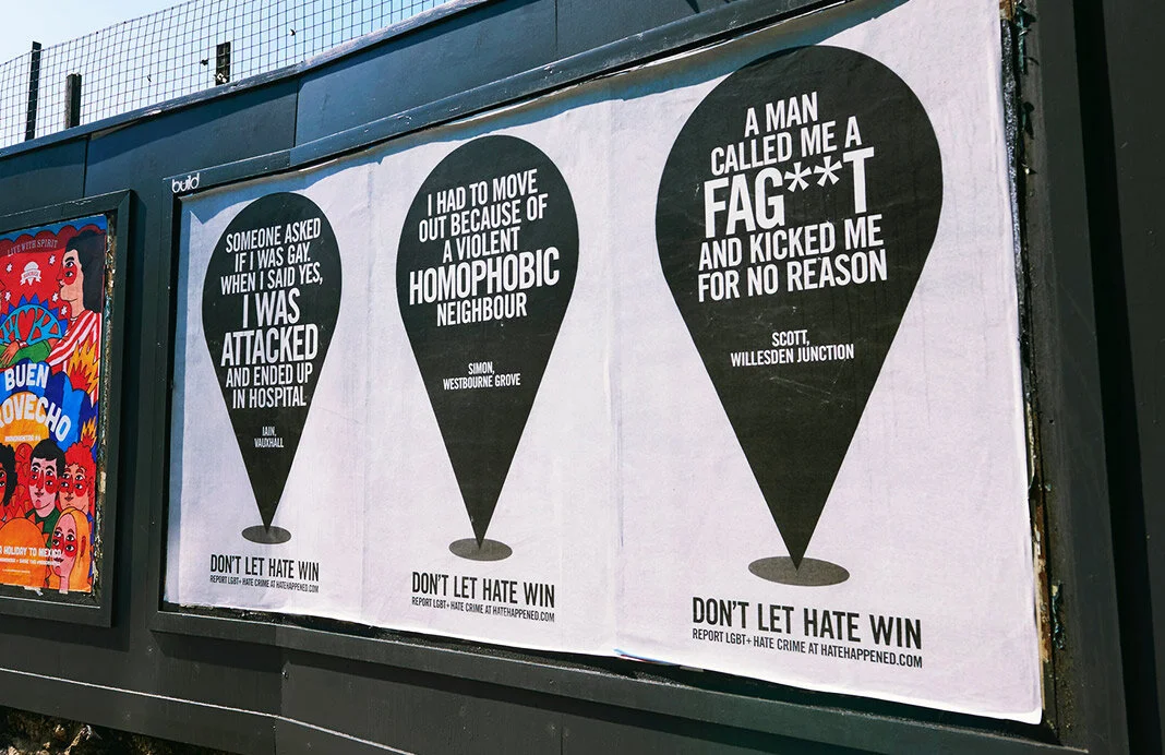
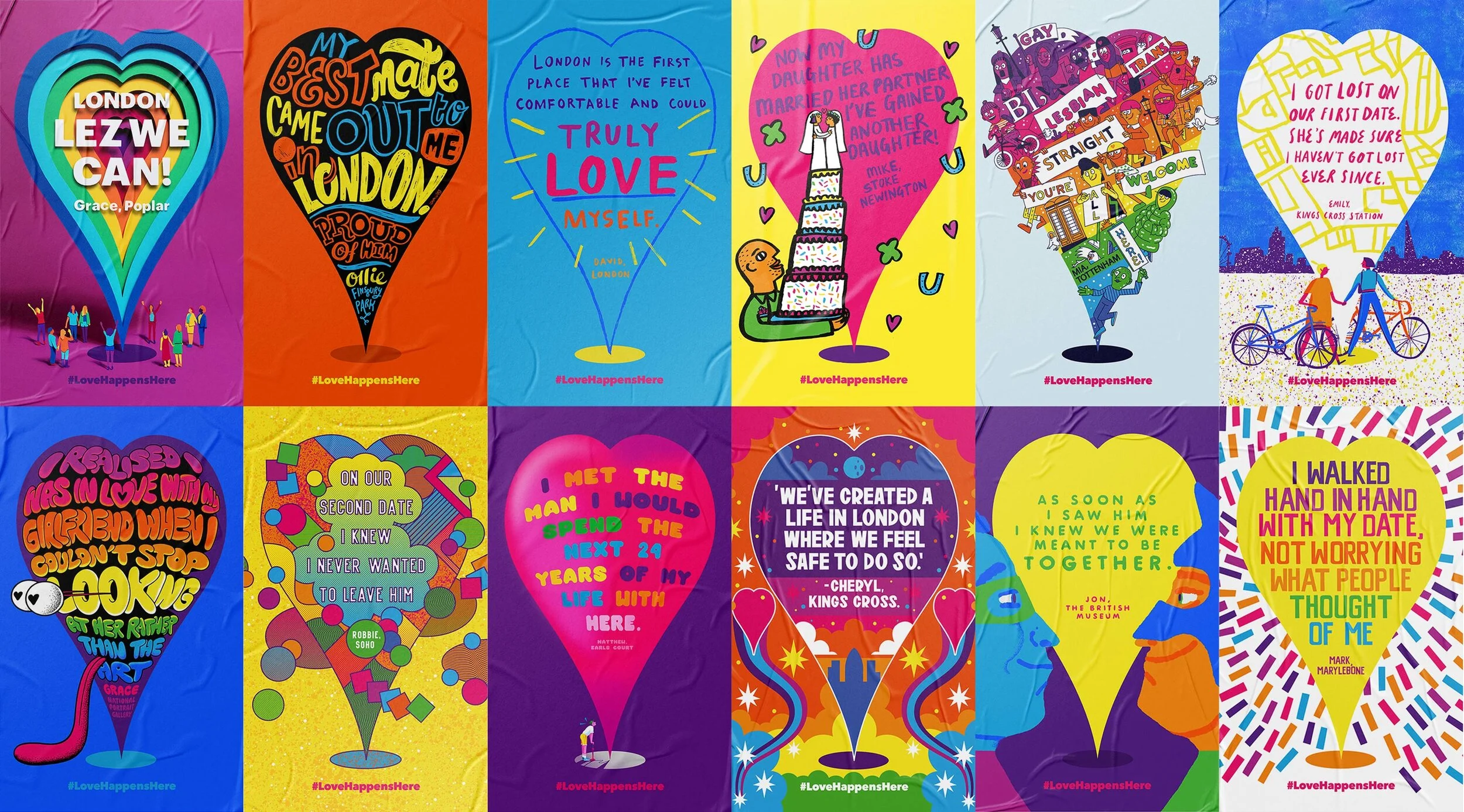
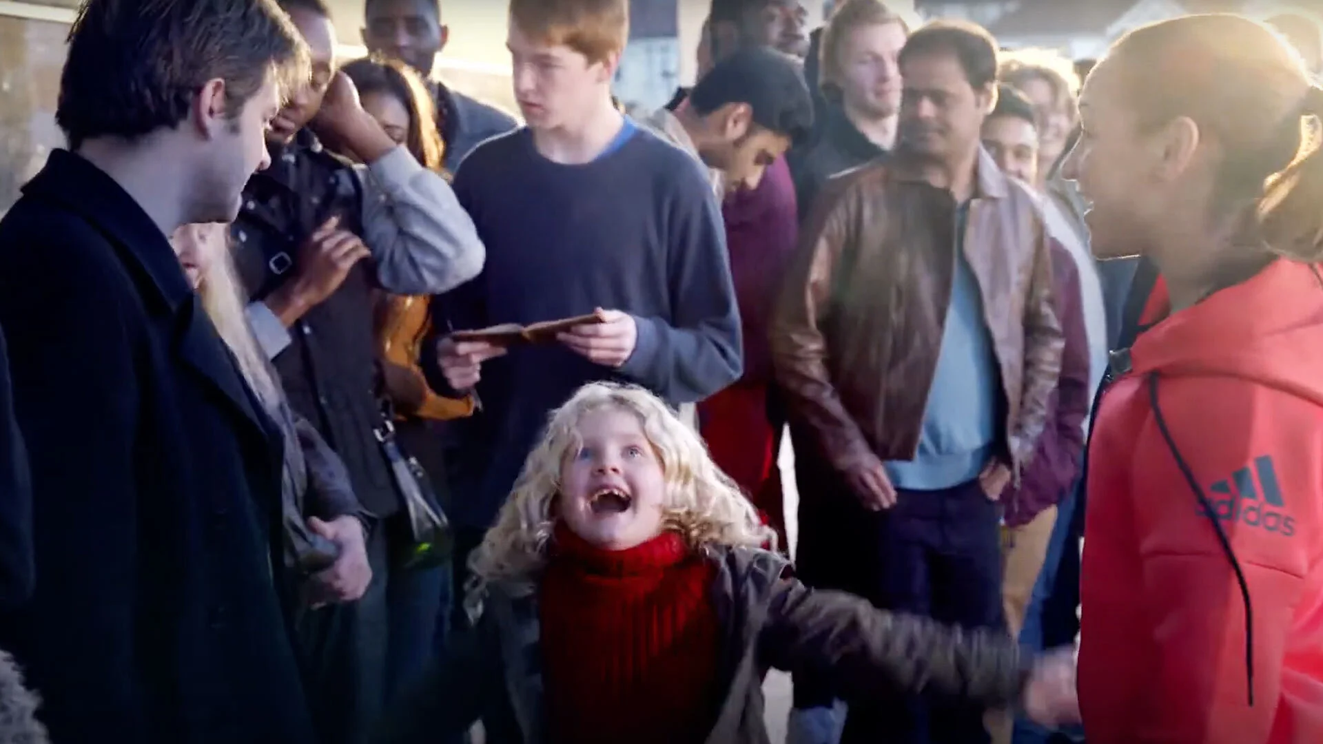
Every year Pride in London changes its theme to reflect something real facing the LGBTQ+ community. The year we worked on it, research showed that over half of LGBTQ+ people in London had experienced hate crime in the previous year, a statistic most Londoners had no idea about.
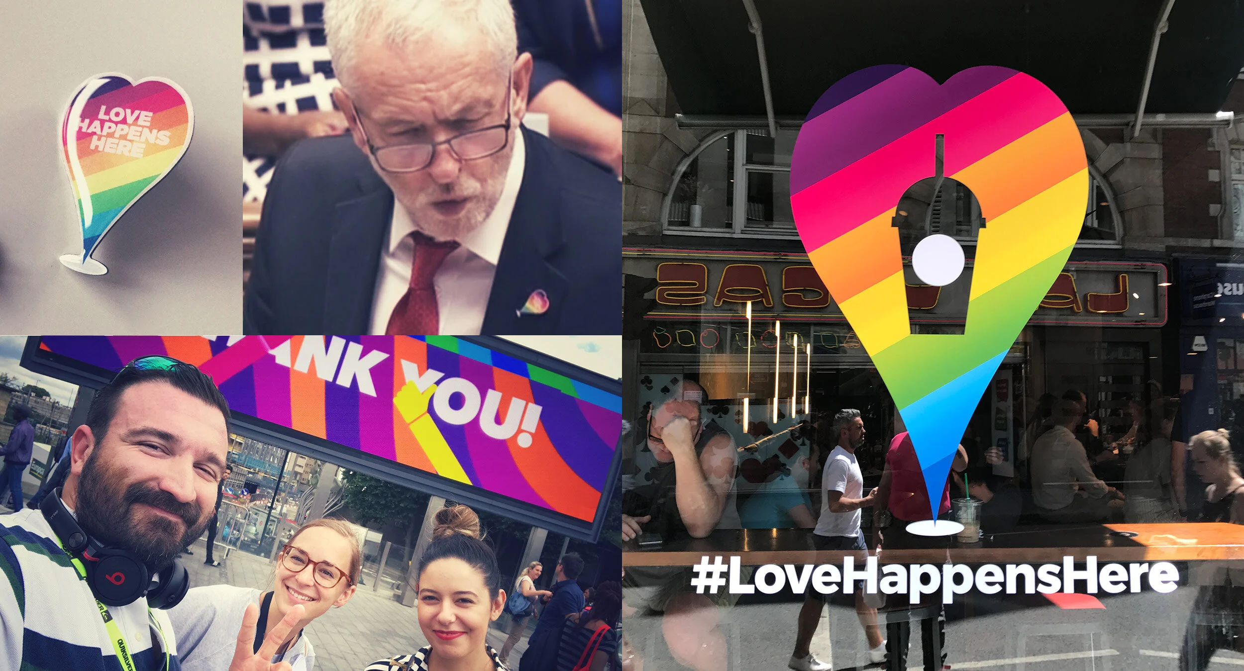
We collected real experiences of hate, mapped them to the locations where they happened, and placed unbranded posters at each site. Then we flipped it. Real stories of LGBTQ+ love, contributed by the community and allies, were turned into illustrated posters by over 40 artists and placed across buses, shops, billboards and coffee cups across the city.
The Love Happens Here heart, inspired by a location pin, became the symbol of the campaign and led to a Google Map marking every story in its location. At its peak the hashtag was used three times every second, reaching 244 million people. Jeremy Corbyn and his shadow cabinet wore the pin in Parliament. Merchandise sold out. The campaign won at Creative Circle, Kinsale and British Arrows.
Pride in London
Santander
A long and varied relationship with one of the UK's largest banks, spanning brand identity, campaigns, design systems and more.
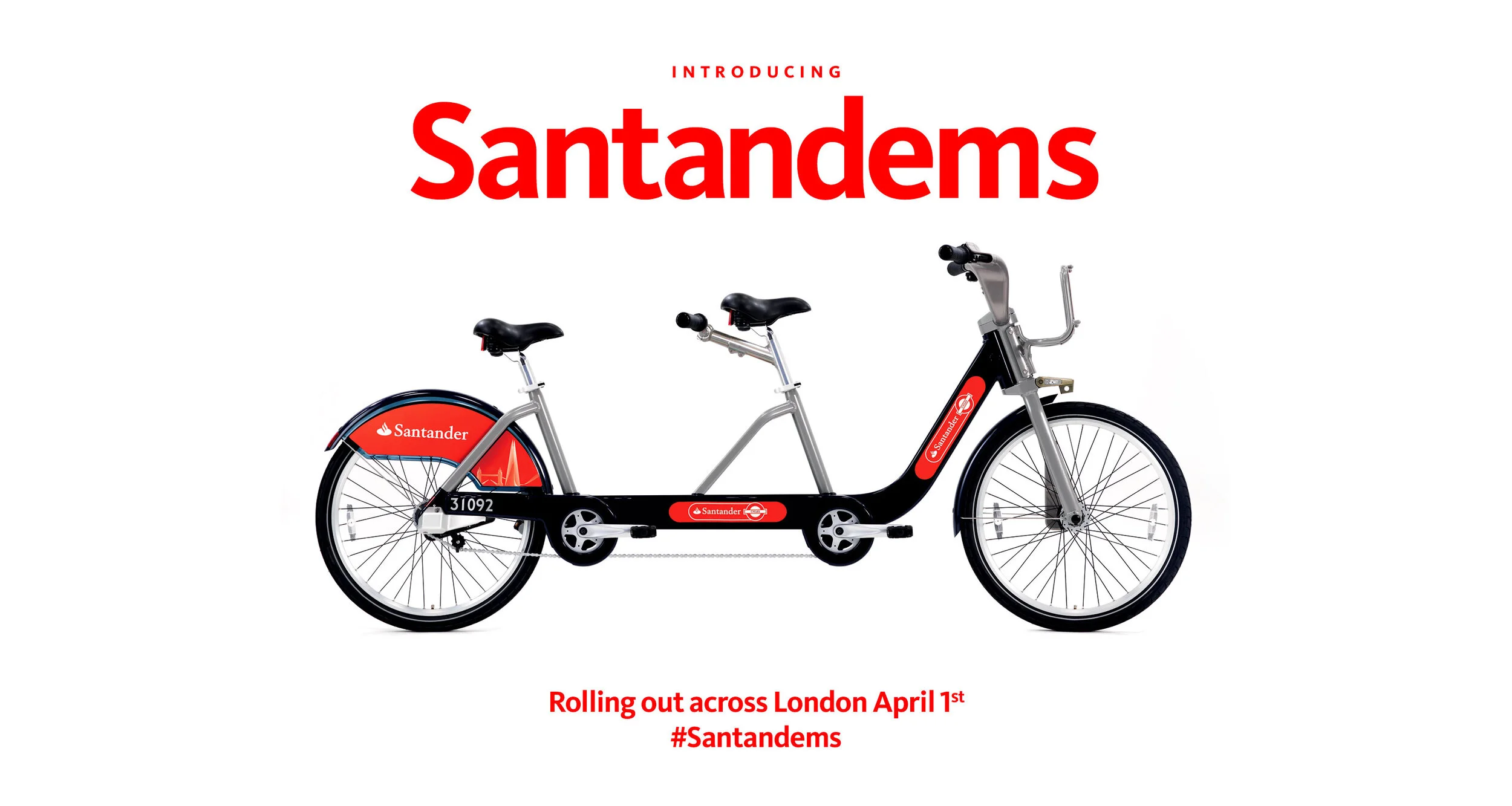
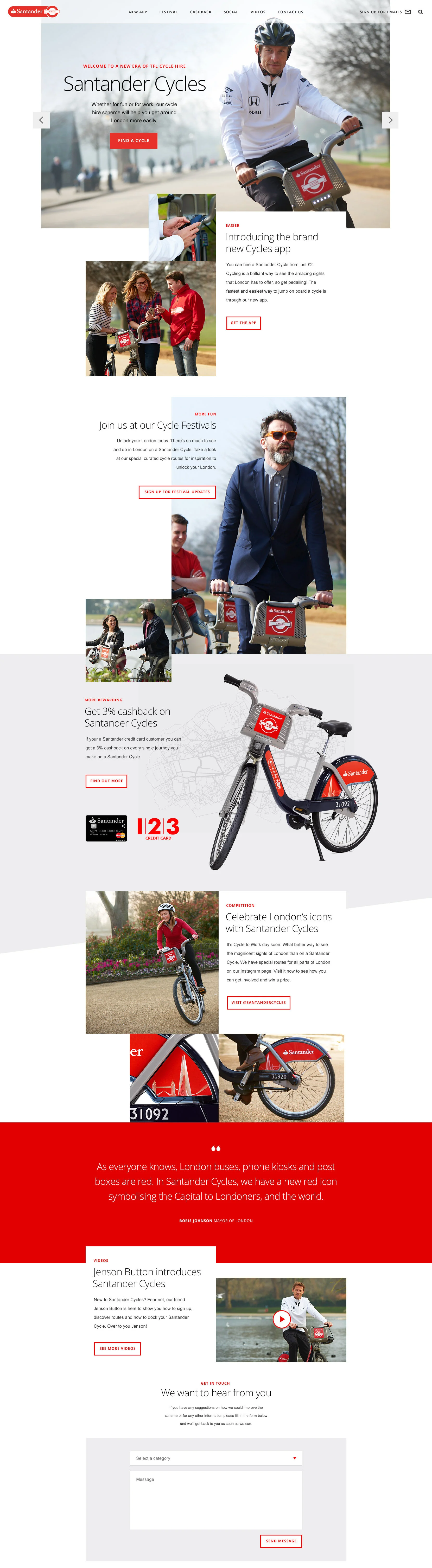
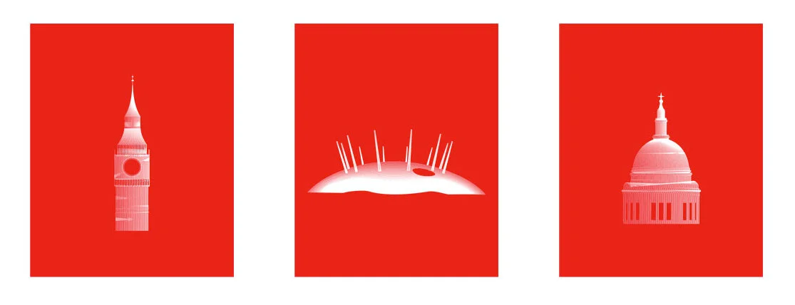
When Santander won the pitch to become TfL's official sponsor for the city's docking bike scheme, we gave the bikes a new name, identity, graphic design style and advertising guidelines, turning something previously known for Barclays blue into something distinctly Santander.
On the campaign side, the Keep On campaign achieved record sign-ups, making it the most successful Santander campaign since the launch of the 1|2|3 account.
When Santander acquired Abbey National and inherited hundreds of fragmented web pages, we built a unified design system adopted across multiple teams and agencies. And when the brief came to animate the iconic flame logo for the first time in its 33 year history, we worked with The Mill and DBGG to bring it to life across 2D, 3D and everything in between.
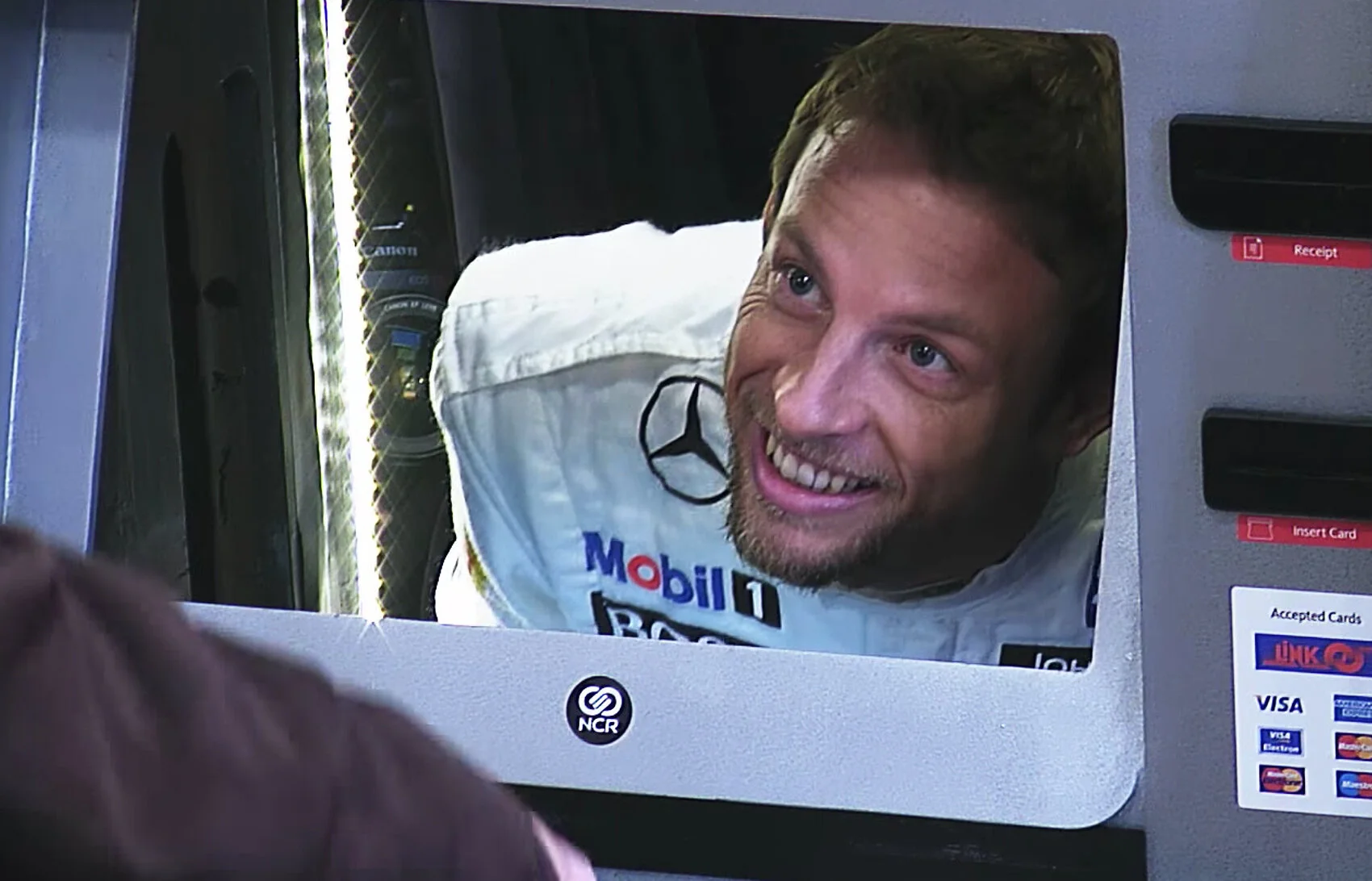
Not everything had to be big and serious though. One Christmas, we installed a fake ATM in a Santander branch with a button that said Push The Jenson Button. When unsuspecting customers did, Jenson Button himself popped out of the screen with a Christmas hamper and £100. Directed by Marcus Liversedge, it became Santander's most viewed video. Sometimes the simplest ideas are the ones people remember most.
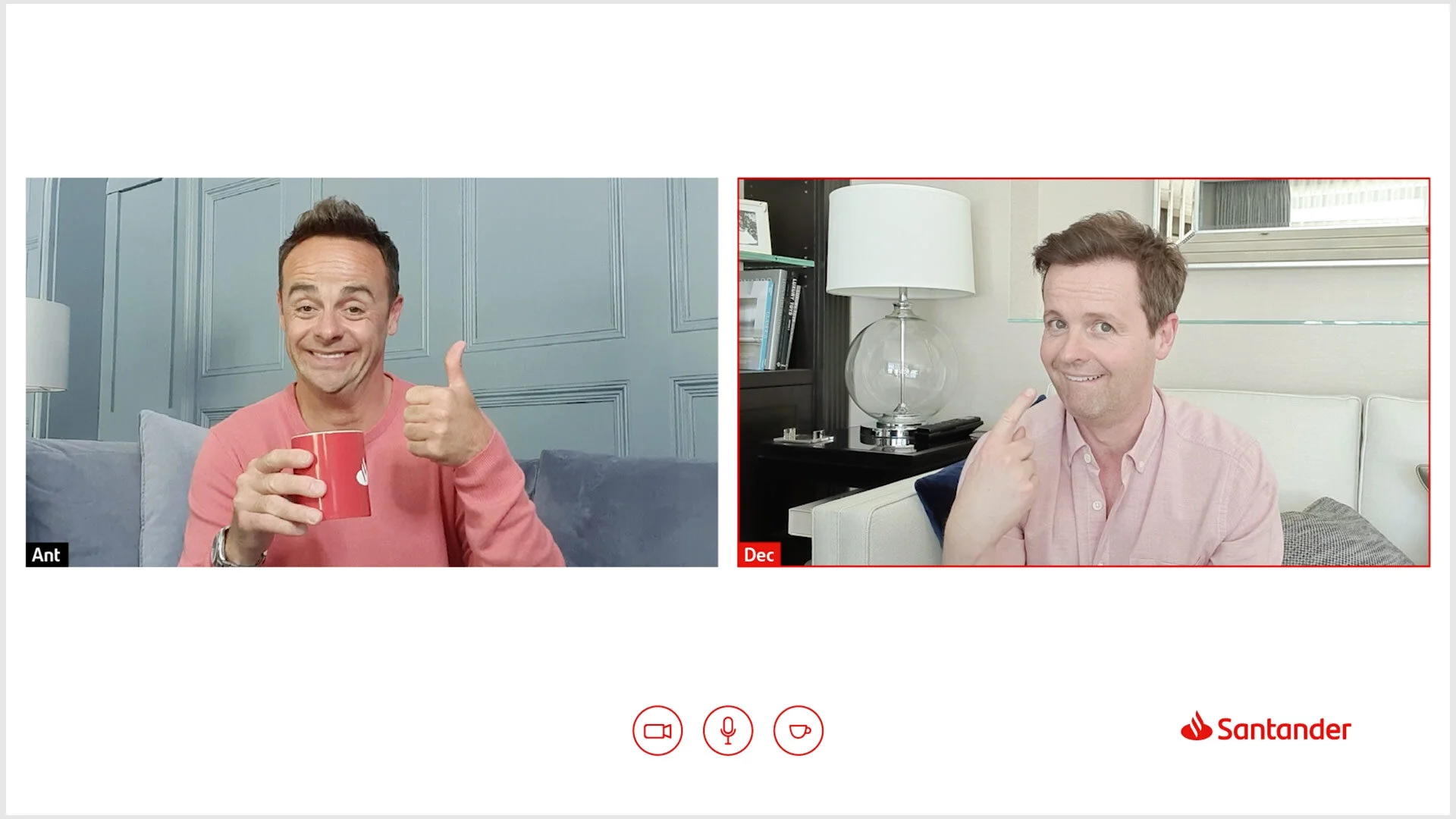
During lockdown, we also created a campaign inviting Santander branch staff to have virtual cups of tea with isolated elderly customers, fronted by Ant and Dec. Small idea. Big heart.


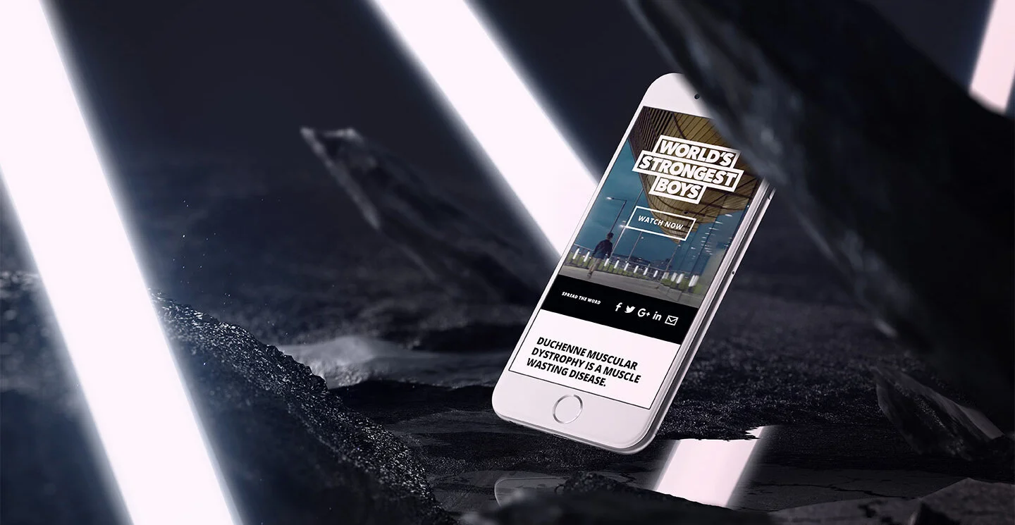
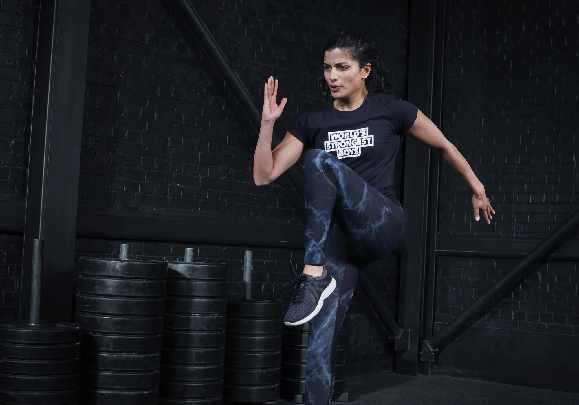
Duchenne UK
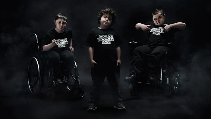
Duchenne Muscular Dystrophy is a fatal muscle wasting disease affecting one in 3,600 boys. Duchenne UK needed to stand out in a crowded charity sector and drive donations toward finding a cure.
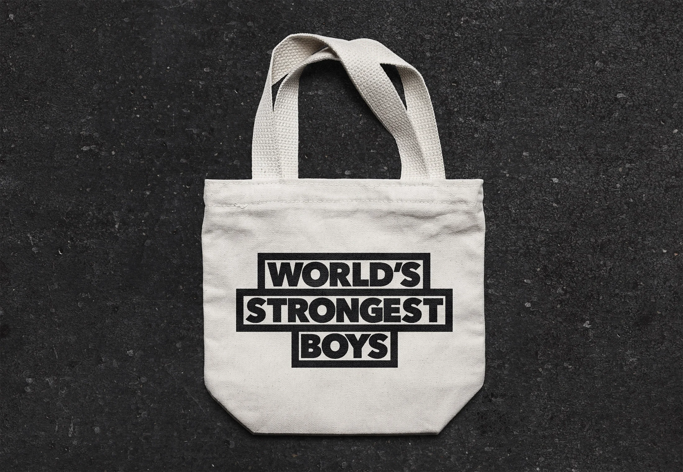
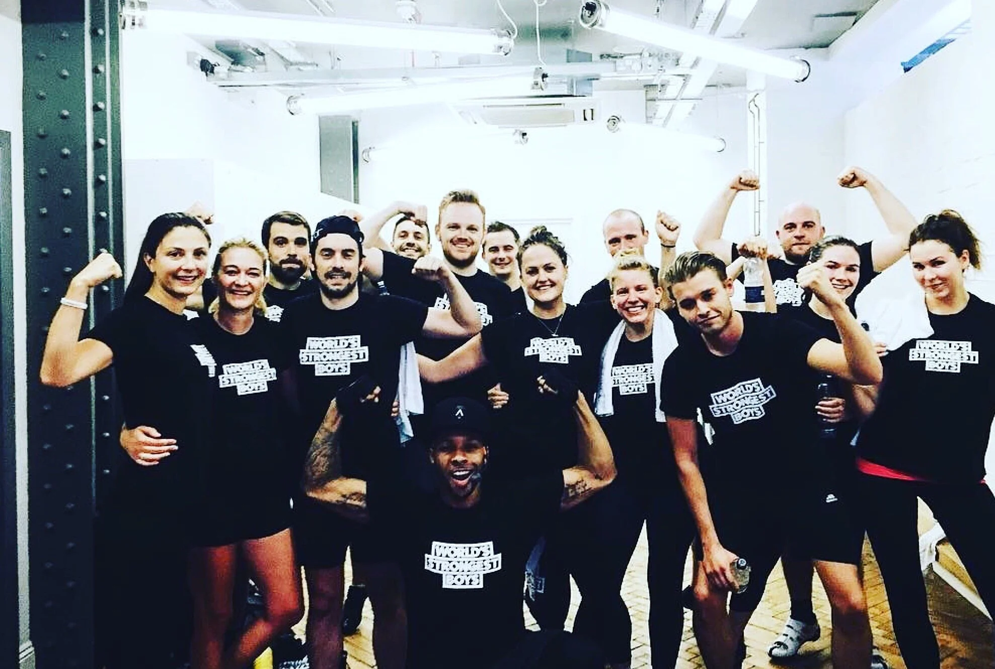
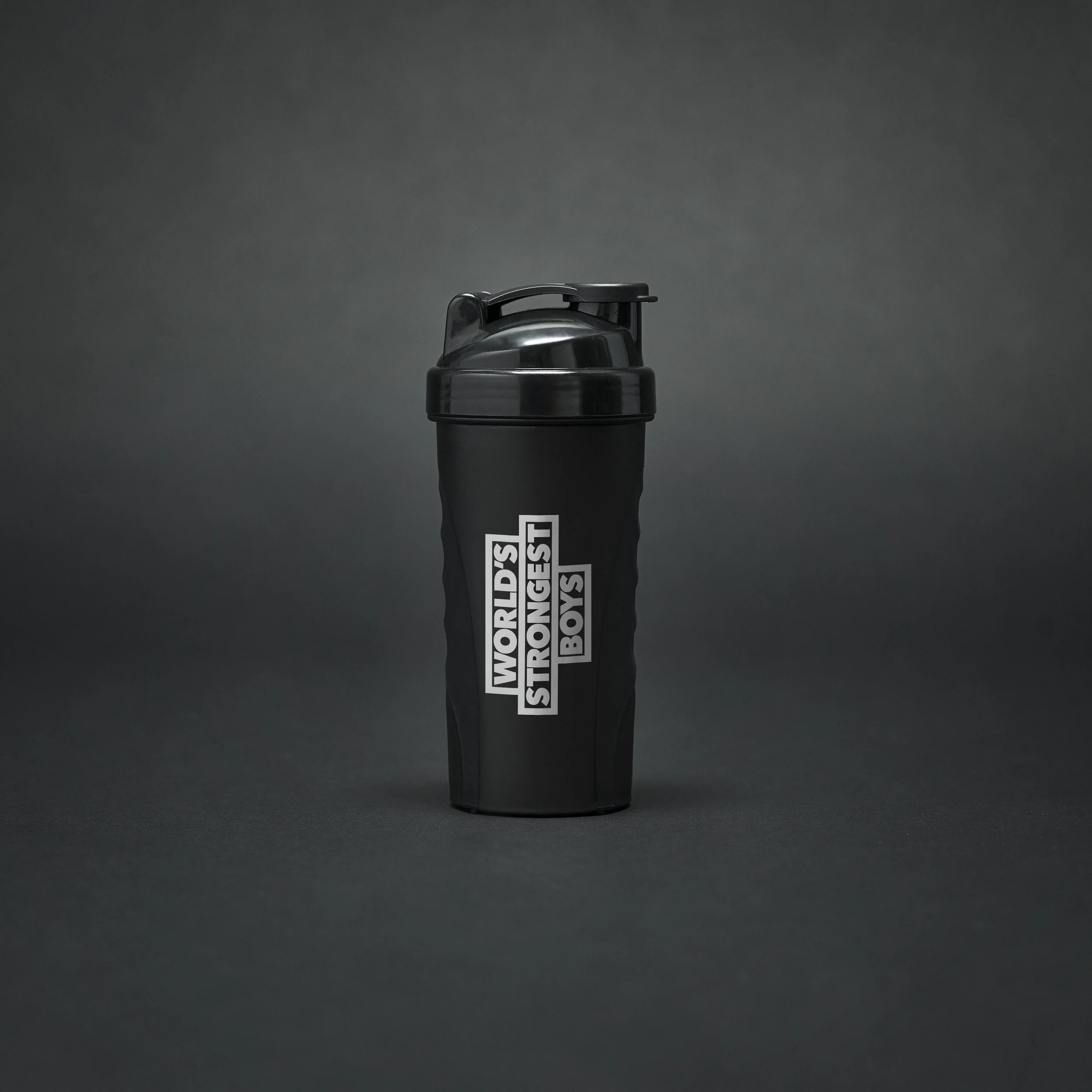
The insight was simple: living with Duchenne makes these boys anything but weak. We built the entire campaign around the idea of the World's Strongest Boys, and deliberately designed it to look like a sports brand rather than a charity.
The logo was inspired by a weightlifting bar. The typography was heavy. The photography was epic. Four sporting influencers created bespoke fitness classes. Protein shakers, gym t-shirts and tote bags sold out. Thousands of new donations came in. National press coverage followed. The design work was recognised at Creative Circle.

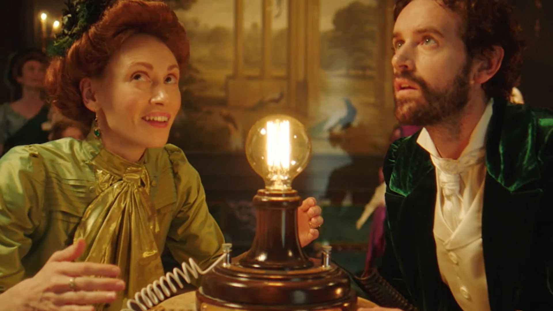
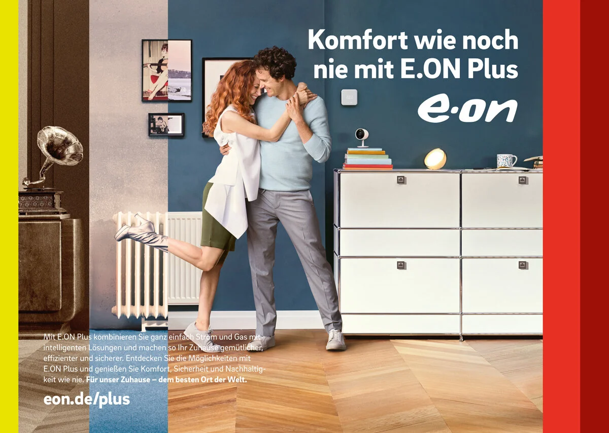
E.ON
A European TV campaign for E.ON's new smart home technology, built around a single seamless journey through time. Starting in the 1880s, moving through the 1920s, pausing at the moon landing in 1969 and arriving in a smart home in 2020, all in one continuous take.
Directed by award-winning director Hanna Maria Heidrich, it was a genuinely cinematic piece of work for an energy brand that wanted to position itself at the forefront of how homes evolve. Proof that a utility brief doesn't have to feel like one.
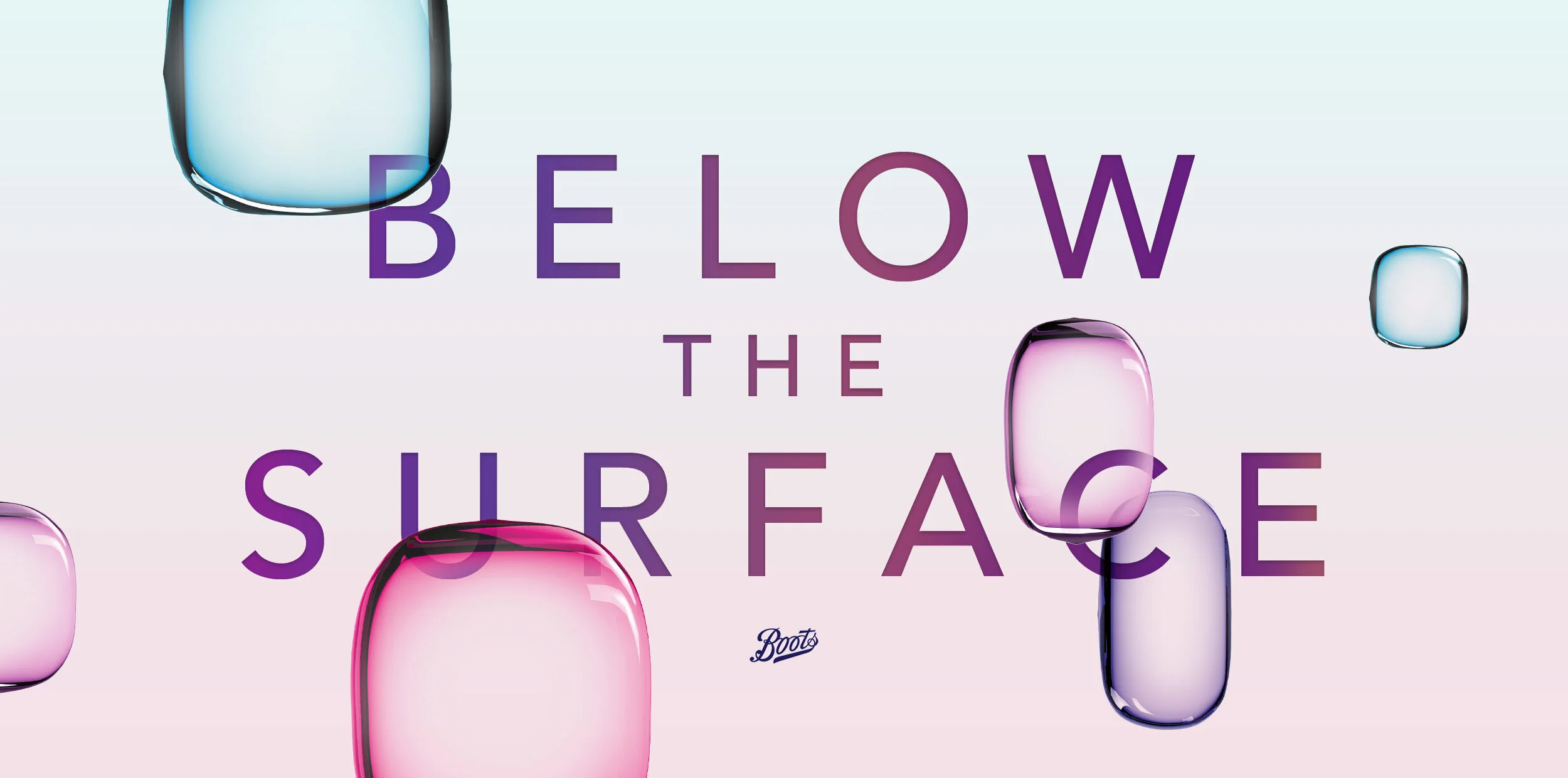
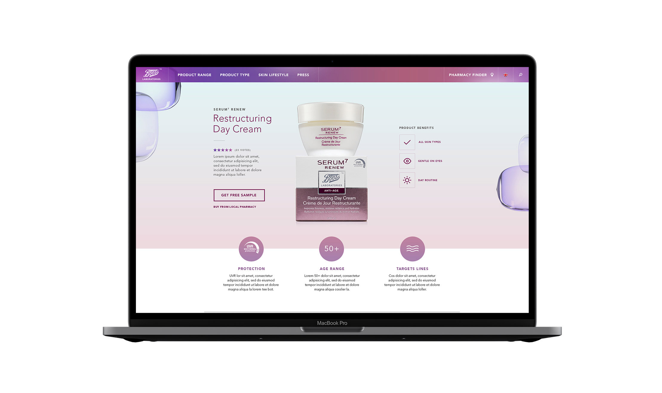
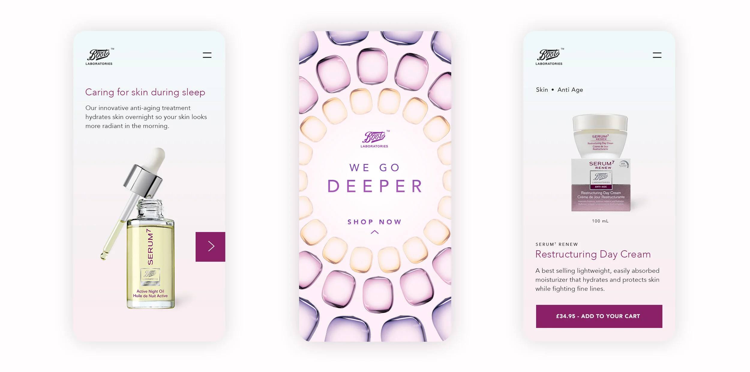
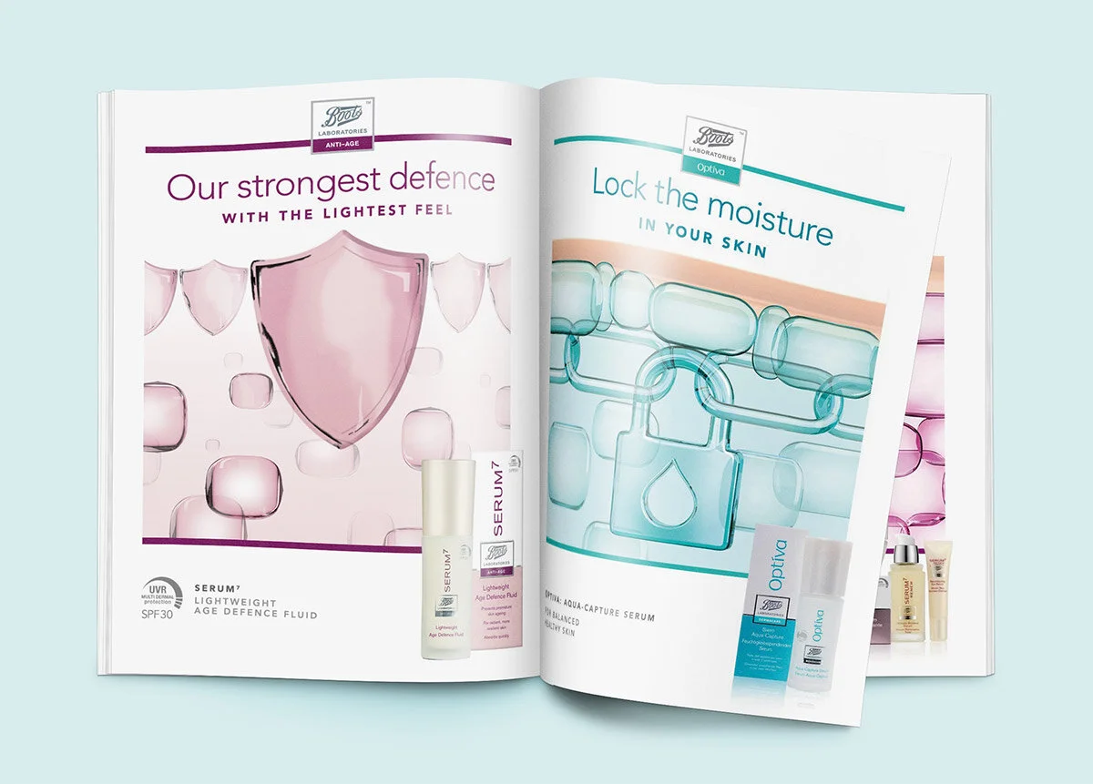
Boots Labs
A new identity for Boots Laboratories, a cruelty-free European pharmaceutical skincare brand struggling to stand out in a crowded market. The strategic idea was Below The Surface, built around the science behind skincare and the role of active ingredients at a cellular level.
The identity centred on an elegant glass cell motif that could morph, shift colour and adapt across every touchpoint, from in-store displays to digital platforms. The result was a coherent, modern design system that gave marketing teams across Europe a consistent and distinctive brand presence to work with.


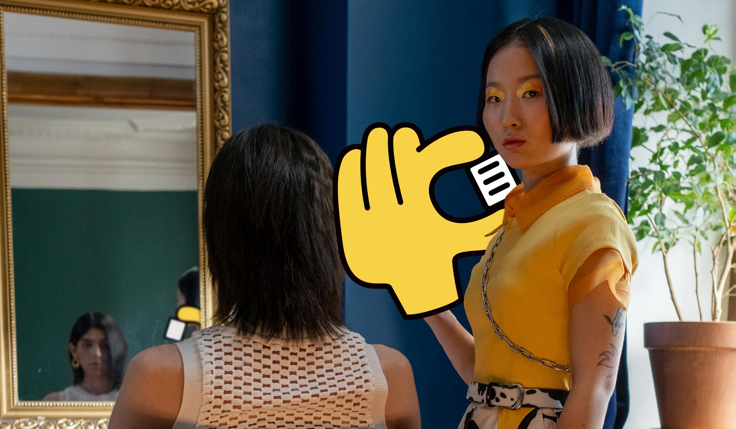
Statement
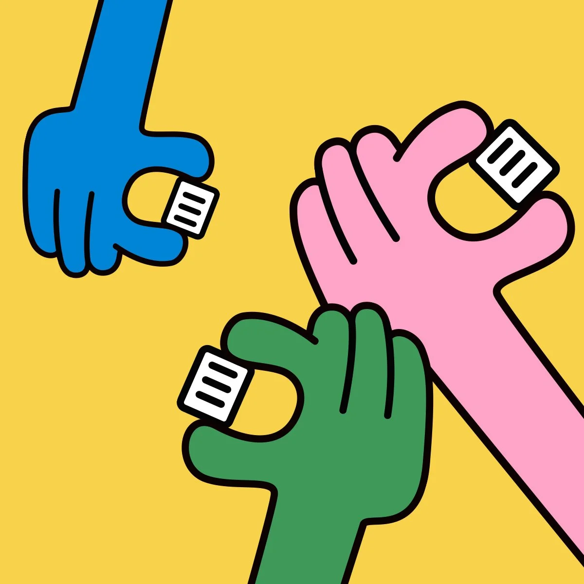
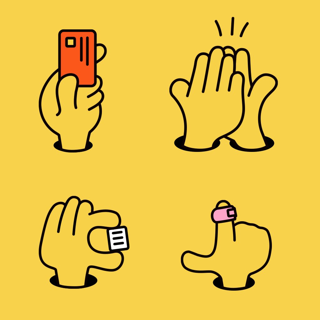
Brand identity for Statement, a price comparison platform helping SMEs find better rates on card payment machines. The brand idea centred on the one thing customers feel when they use the service: the relief of finally seeing a statement that makes happy reading.
A hand holding a tiny statement became the key visual, running throughout the work alongside a vibrant colour palette, playful imagery and a friendly typeface that made the brand feel distinctive in a sector not known for personality. The identity was built ahead of investor pitches and contributed to the founders securing £1.5 million in pre-seed funding.


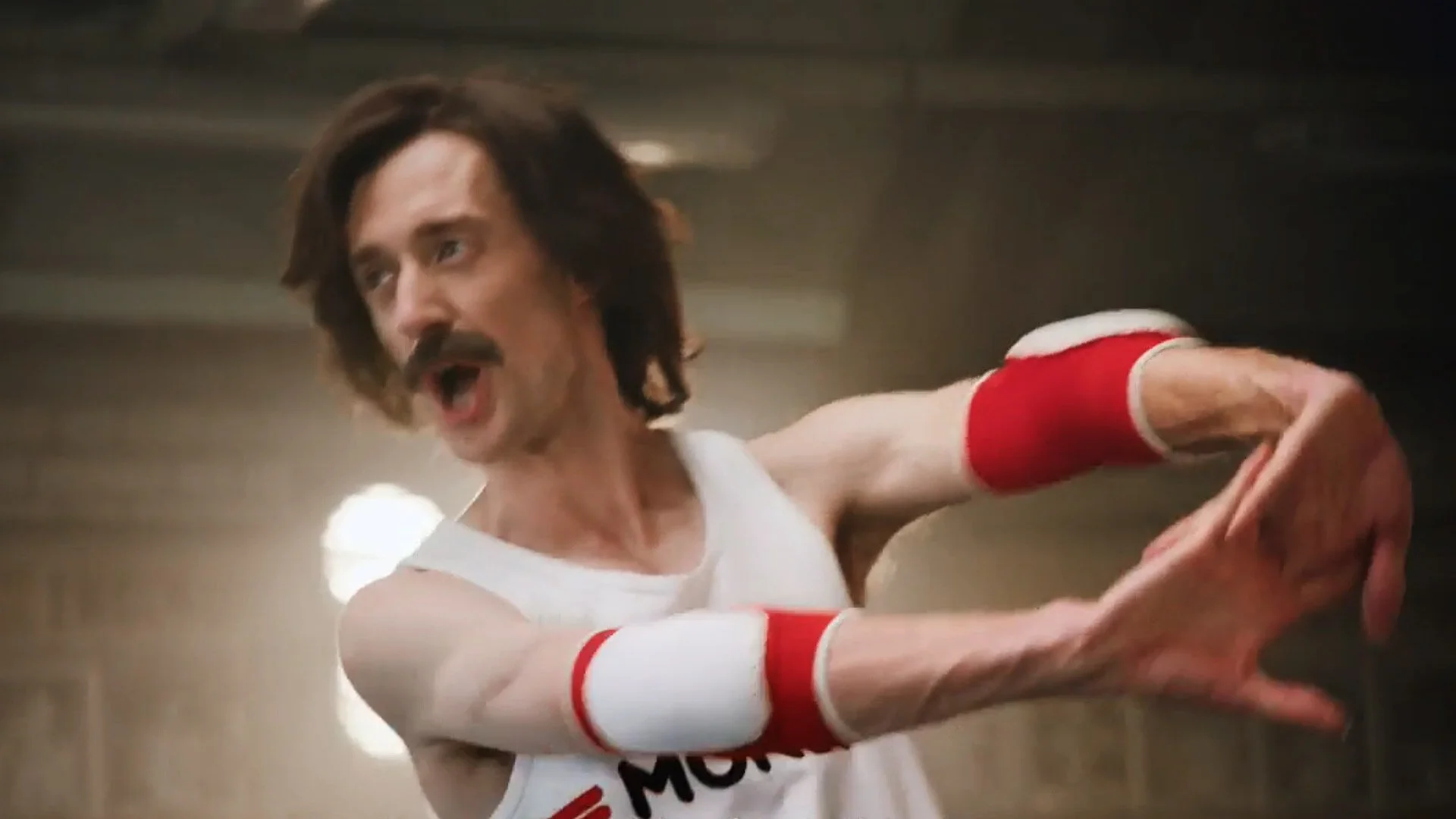
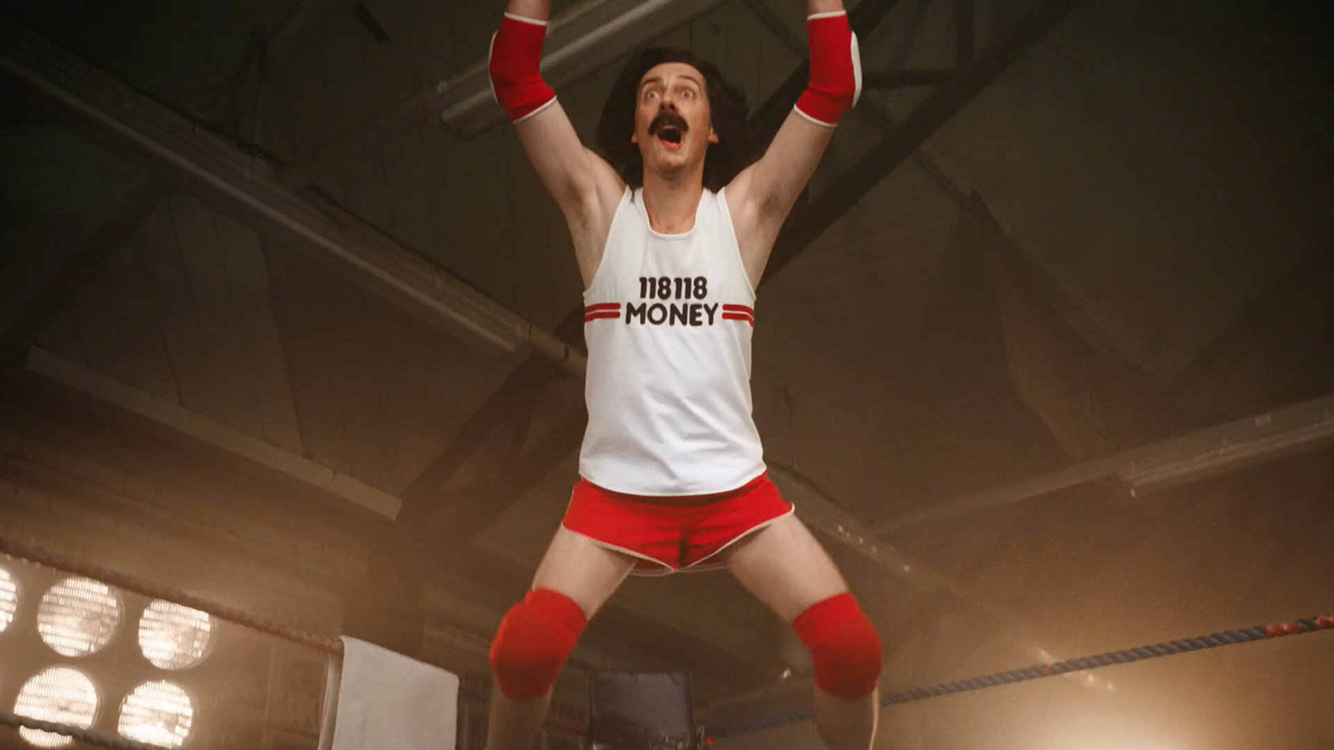
118 118 Money

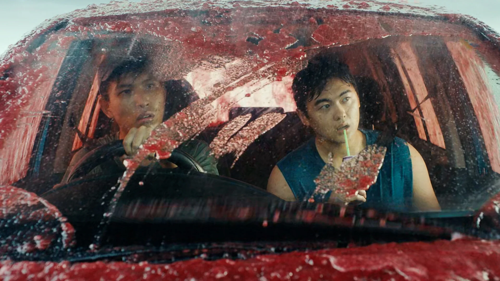
118 118 Money were the only credit card provider that wouldn't charge customers for ATM cash withdrawals. The brief was to make sure people knew about it. The solution was to pit the rival cards against the iconic 118 118 runners in a WWE style wrestling match. Ridiculous, fun, and impossible to ignore.

Green Flag
Green Flag is one of the biggest breakdown services in the UK, going up against the AA and RAC, but with nowhere near the same level of public awareness.
The brief was simple: make people notice them. The campaign, built around the line Who The Fudge Are Green Flag, used playful exaggerated visuals and a quirky voiceover to give the brand genuine standout. Cheeky, memorable, and strategically sound. Sometimes the most direct creative answer is the right one.
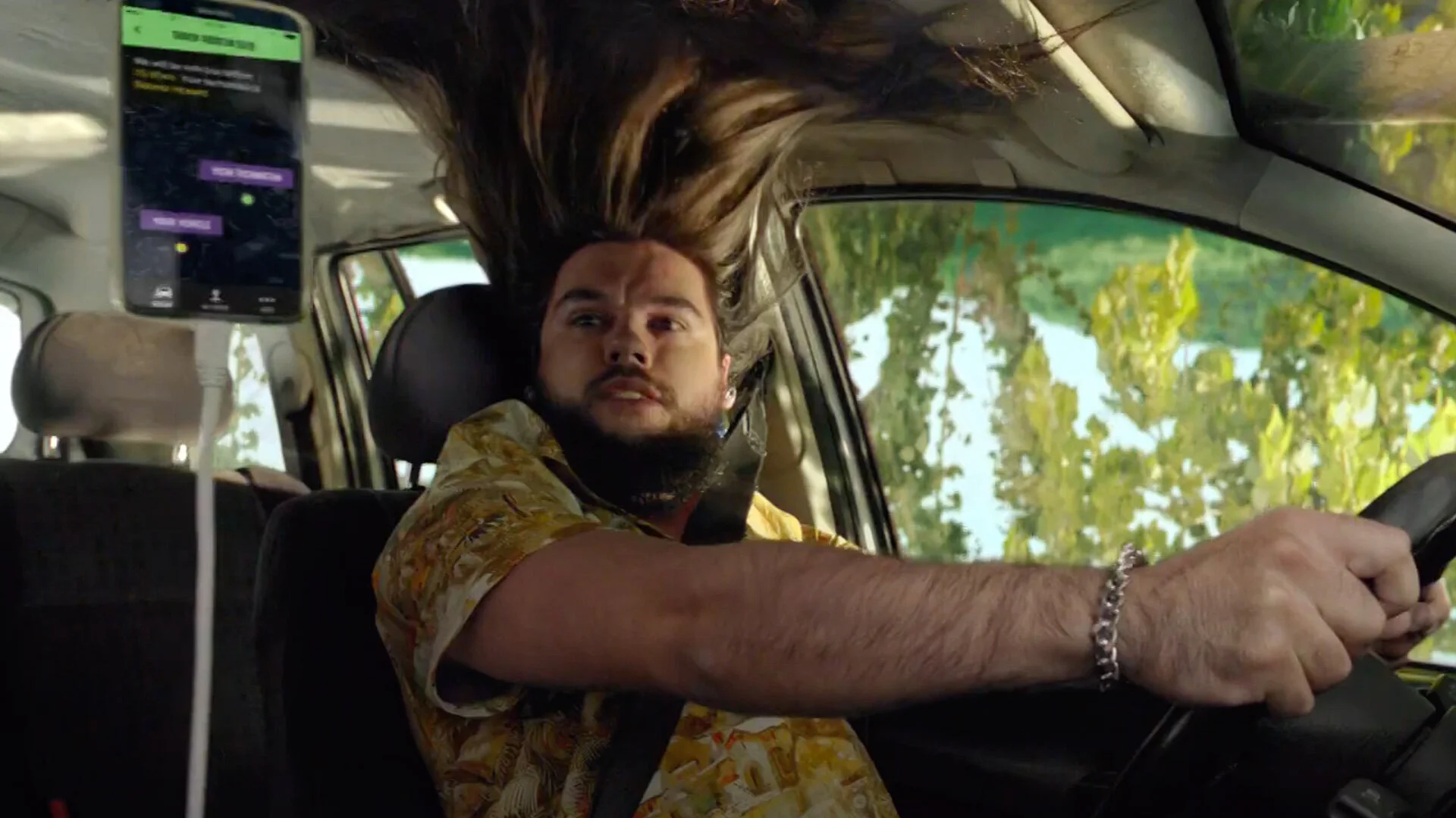
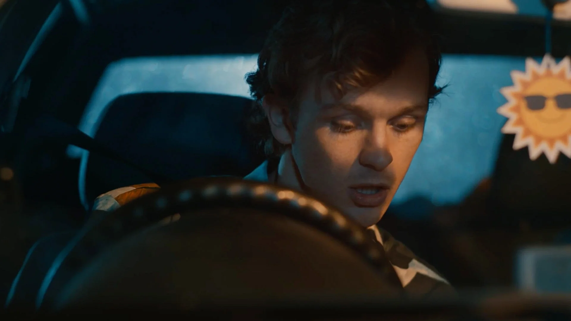
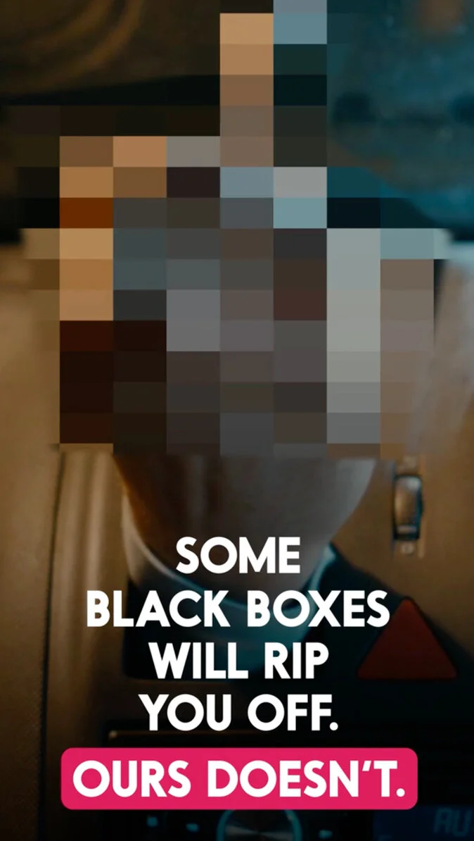
Privilege
Young drivers hate black boxes. Curfews, fines, mileage limits, the whole thing. Privilege's black box had none of those restrictions, which was a genuine point of difference worth shouting about.
So we brought the typical black box to life as a character called The Black Box Bellend. A total fun sponge. Always ruining a good time. The campaign ran across TV and social, and did exactly what it needed to do: make young drivers laugh, remember the brand, and understand why Privilege was different.